Photography can be a challenging endeavor, blending technical and artistic aspects, but it can be made even more challenging in some cases if you're colorblind.
Color blindness isn’t uncommon but what it means is often mistaken. By saying I’m colorblind I’m not saying I can’t see color at all because I can tell the sky is blue and the grass is green. While there are people who only see in black and white, it's far more common for someone to have difficulty telling certain colors apart. Generally speaking, the term color blind does more to confuse than it does to enlighten but it is the commonly accepted way to refer to people both completely blind to color and color deficient (like myself).
There are three basic kinds:
- Completely monochromatic vision: where two or three of the pigments in your eye's cones are missing.
- Dichromacy occurs when you’re missing a pigment: red (protanopia), green (deuteranopia) or blue (tritanopia).
- Anomalies occur where one of your cone pigments isn’t quite right and doesn’t have the right spectral sensitivity, resulting in a reduction of your ability to discriminate colors. The red and green pigments are the most similar so it is easier for differences in them to impact the ability to distinguish colors. Protanomaly occurs when you have a slightly shifted red sensitivity, deuteranomaly (what I have) occurs when your green sensitivity isn’t quite right. Tritanomaly is uncommon (as is tritanopia) and this occurs when your blue pigment isn’t right. This makes blue-yellow discrimination difficult.
As a deuteranomalous person I can see red and green, but I often have a great deal of difficulty telling some hues in that part of the spectrum apart. In addition to this my overall discrimination of many other hues is rather poor as well.
Testing color vision
One test of color vision is to use the Ishihara test with the colored dots that are devised to show certain shapes. They can be made to show numbers for a person with regular vision and appear blank for someone with varying types of color blindness, however the tables can also be turned so that only certain types of colorblindness will see the pattern. Chances are you've encountered these at some point before.
Another more in-depth test is the Farnsworth-Munsell hue test (with numbers of hues ranging up to 100). The hues are broken in to four sets, each a series of color chips with a number on the other side. During the test you organize them by hue from one end of the set to the other. On one end of a set you might have a peach color and on the other end it would be green; while I would struggle with this a color normal person could organize them with little error. The score is calculated by recording the sum of the differences between the number on a patch and the numbers on the back of the two adjacent to it. Since they’re numbered sequentially a perfect score is a 2 for every color. The more you place incorrectly, the higher your score goes.
Below and to the left is what someone with normal color vision and good color discrimination can produce in this test, I'm on the right:
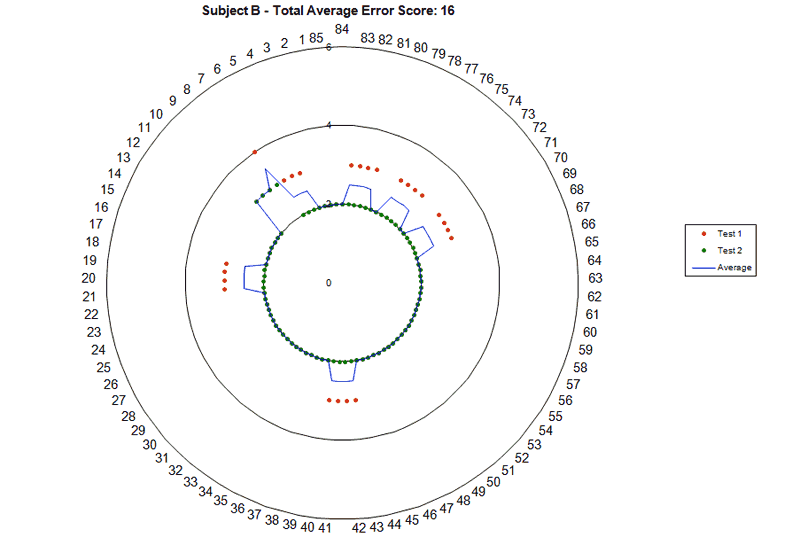
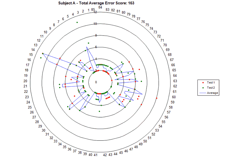
Notice the scale on the radius of the chart (the numbers labeling the concentric rings). My friend with good color vision never exceeds 4, while I go past 10. My two trials don’t even match each other in where I make mistakes, and if I did more trials it wouldn’t improve. My friend did better his second time through, which is normal for most people after they loosen up and get in to the test a little more.
To detect varying types of color vision defects you look for certain patterns on the plots. The hues you have the most trouble with dictate the shape and indicate which type of colorblindness you have. If you have a strong deviation at the 10 and 4 o’clock positions like I do, you’re deuteranomalous. The rest of my scores are also fairly high which indicates my color discrimination is poor for other colors too.
What does it mean?
For someone like me this can make playing with color really tricky. I enjoy both color and black & white photography and shooting color film in particular is tricky since every film has a preset preference for a certain white balance. This can be compensated for with filters but I still struggle when it comes to color darkroom printing. Obviously I can’t print color in an enlarger very well, so when I do I have often had to rely on someone else to steer the colors in the right direction.
Computers make color much easier for me but it’s still not perfect. Someone with good color vision can much more easily go through images and adjust color temperature, saturation, and more. I can't do that very easily and have trouble being confident in my results. Calibration helps on a gross scale but fine tuning (other than zones on a gray scale/contrast and brightness levels) is mostly beyond me because my discrimination is poor enough to make me an unreliable judge of color.
The most common color problem for me is white balance. If someone with normal color vision wants to adjust the white balance they can usually just do it by eye and get something reasonable. If I want to adjust it I have to find something in the scene that should be neutral and adjust the overall balance of the scene until that object has uniform RGB values in the color picker. If I want to push the color of something a certain way, I have to use what I know about the RGB values of colors to adjust something to the values I have in my head, and hope they are the right colors. It is very easy for that to go horribly wrong, and a nice sunset could turn green or I could suck green out of trees by adding too much magenta.
Digital photography has made some things much easier for me, I have more room to correct white balance with digital and better tools to do it with. I can also adjust in raw conversion later using color temperatures based on lighting conditions or even better by using a reference card while shooting. Working with film doesn't make it as easy, corrections can be made but you can only go so far. It is easier to please my eyes because I am unable to see differences that might be obvious to the average observer, but I still try to get things “right.”
In the end
I can do a lot of the things everyone else does but often with less confidence and often with inconsistent results. I could just convert everything to B&W through the channel mixer or with other tools and have a lot of fun that way, but I like color photography as well and as unintentionally strange as I can sometimes make things look, I don't want to give it up.