Since switching over to Windows 7 I hadn't thought to see whether I could get eyePilot to work. I never succeeded with Vista, even with the compatibility modes and everything else. A week ago I was playing on my laptop (while writing the previous post) and decided to try installing it and was surprised to see it working. Today I installed it on my desktop to verify that it wasn't a one-time fluke. Success! It works in Windows 7 without any need for compatibility mode or being run as administrator. It isn't 100% perfect (and those things don't fix it), but considering they may never update/release a new version (or may never do it in our lifetime) this at least gets it running and doing what I need it to do!
Software for the colorblind: Colorblind Assistant
While I'd still love to see EyePilot updated and useful since it offers a host of handy features, its creators seem to be content to sit on their duffs ignoring the world while claiming they are working on an update (they are still "working on a Vista compatible version" supposedly... riiiiight). Until they (or more likely someone else) step up to the plate I am not currently aware of any other programs with the features EyePilot sported however that doesn't mean there aren't plenty of other little helpful programs.

Random web searching brought me across a nice little program called Colorblind Assistant which is in many ways an updated looking WhatColor which I have covered previously. Feature wise they're basically identical so take your pick. Both will give you a standardized name for the color under your cursor, as well as read out color data and provide a zoom of the area immediately around your cursor. Both are built for Windows and will run on basically any version of said platform and require very little in the way of resources. The Colorblind Assistant application is about twice the size of WhatColor but both are under a megabyte and will sit unobtrusively on your desktop reading out color data to you if you choose to leave them running.
Although WhatColor would like you to pay $8 to register it (it's a "fully functional evaluation copy" distributed as shareware), Colorblind Assistant is completely free. So if you are cheap and have moral pangs over not paying for WhatColor, Colorblind Assistant will leave you with a clear conscience.
Newark State School
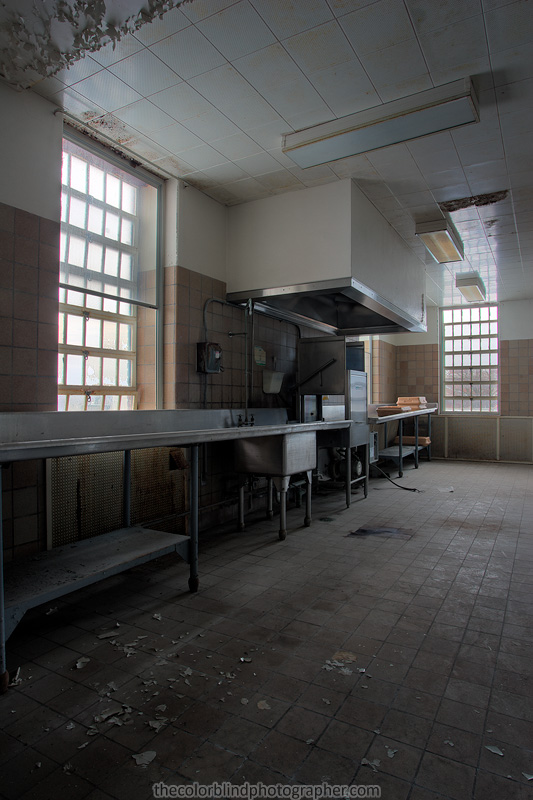
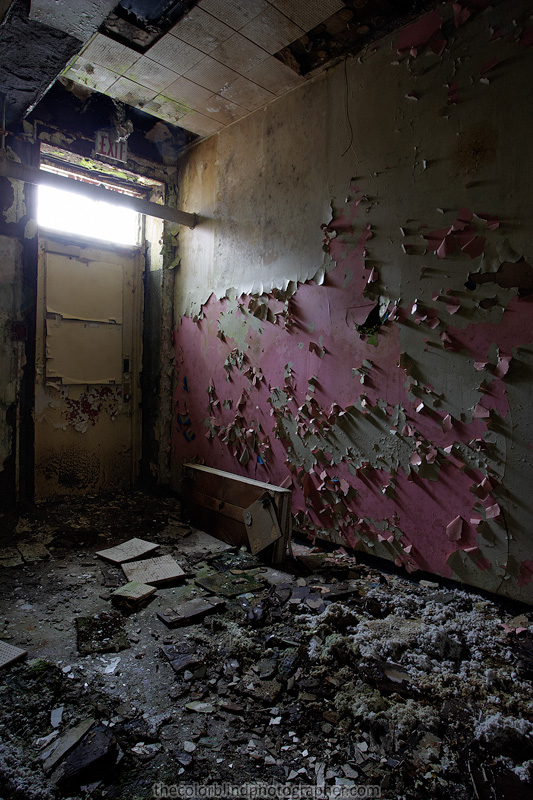
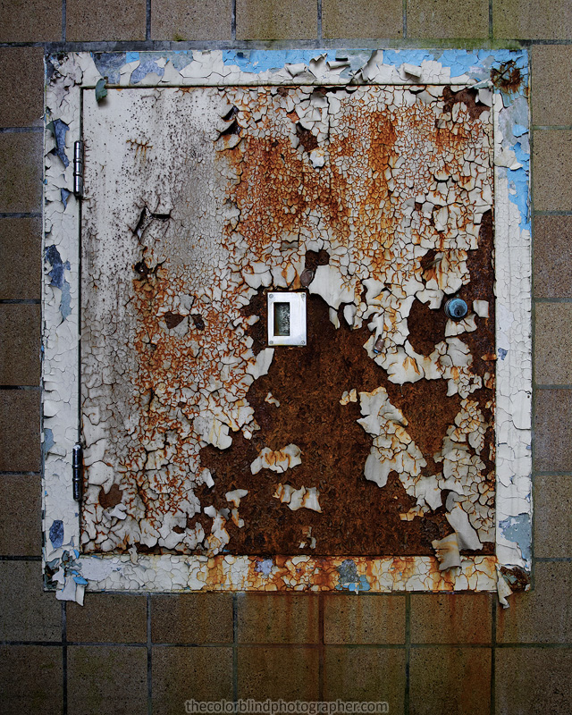
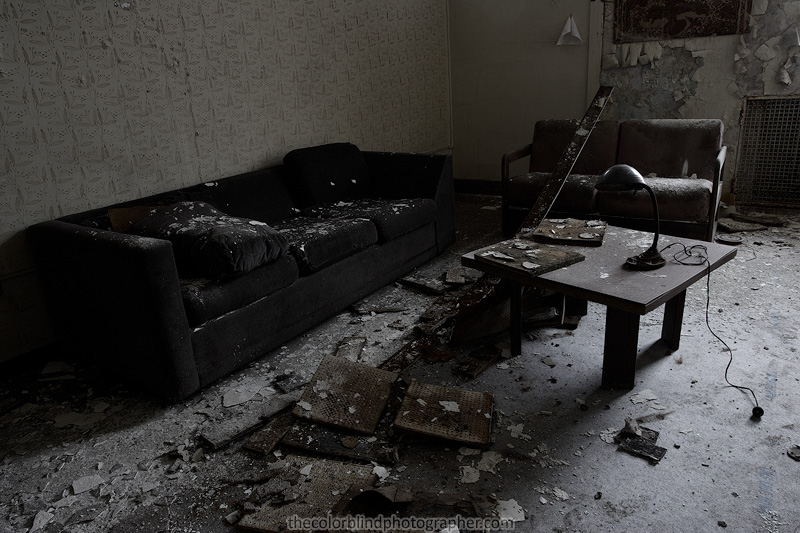
Rounding out the weekend of exploring, we visited the Newark State School, an abandoned collection of buildings which served people with disabilities. Some of the buildings on the campus have been re-purposed and are being used but many remain abandoned and continue to decay.
The campus is quite large, and some of the buildings are equally enormous. We only visited one of the buildings on the campus and there is so much still left in it that it really tells you a bit about the history of the place. On the second floor there are even names of the people who once lived in the rooms still above the doors. Because this "State School" was for the mentally handicapped there were some interesting contraptions in the building, such as a chair bolted to a scale for weighing patients; I have heard that straight jackets and other restraints can be found but I didn't see them.
The Newark State School has had many names since it was originally founded in the mid-to-late 1800s; originally the state school only served women however men were eventually admitted as well. The school did more than house and care for the mentally handicapped, it also taught them skills; houses near the campus were used as a sort of group home for patients who had mastered a particular occupation and either worked at the School or other nearby jobs. To read more about the Newark State School I'd suggest following these links:
Being the first institution that I've explored, it was a pretty exciting day. There is so much so see there and I'm sure so much interesting history buried in the rooms full of decaying relics. While the building isn't terribly interesting architecturally, it still has an eerie presence and fantastic light inside thanks to all the windows. I'm very hopeful to return and document more of the building and hopefully look a little deeper in to the contents of some of the rooms.
Other buildings on the campus also look incredibly promising; there is another much larger building with a more interesting looking layout and exterior that I'm sure would be well worth exploring. I'm unsure of what the purpose of the building we entered was but it seems like it was used for both housing and recreation.


Software for the colorblind: HueVue for the iPhone
The flexibility of the iPhone platform is allowing for a broad variety of tools to be developed for it which intend to address issues of interest for colorblind people such as myself. While I still don't own an iPhone (and don't intend to get one), this is another tool that can identify colors, simulate color blindness and provide color matching and coordination features.
HueVue performs a number of handy functions with an a easy to use interface. It can identify colors as well as try to alter colors to simulate colorblindness or compensate for the colorblind user. While those features are nice and not that uncommon it also has some unique features designed to assist with color coordination and color matching. Overall, if you're looking for a utility like this for your iPhone HueVue is another one worth considering.
To learn more about HueVue's wealth of features and its creator I'd definitely recommend checking out the HueVue website.
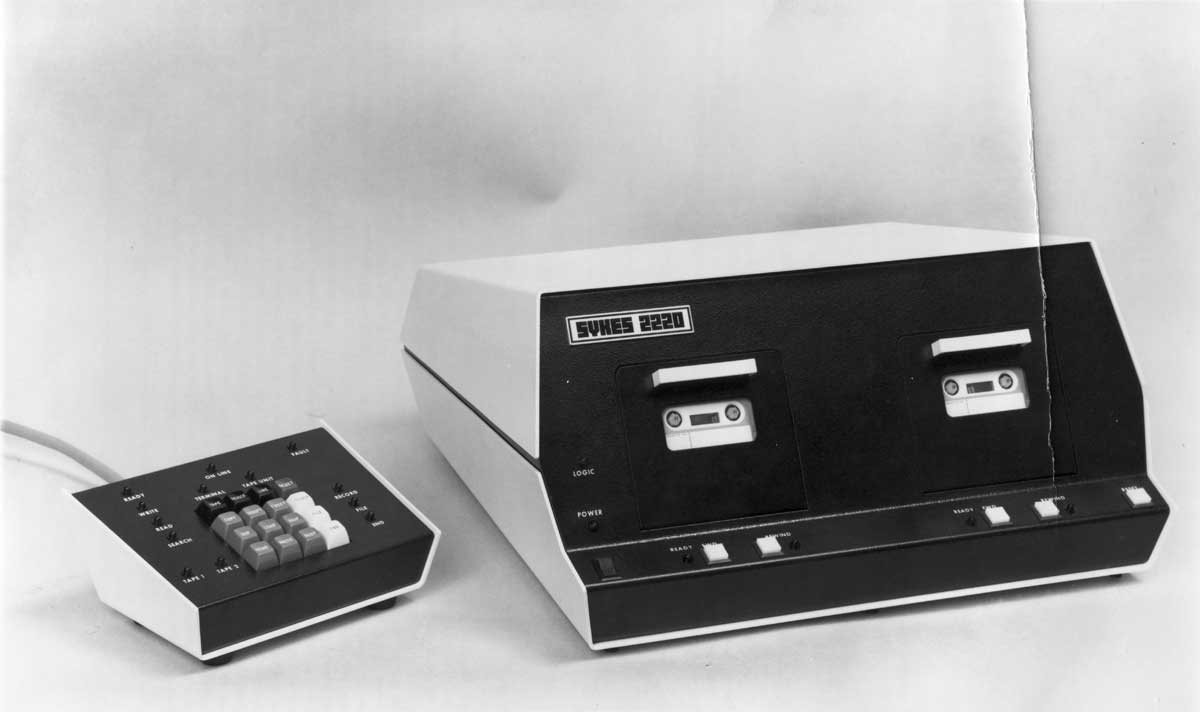
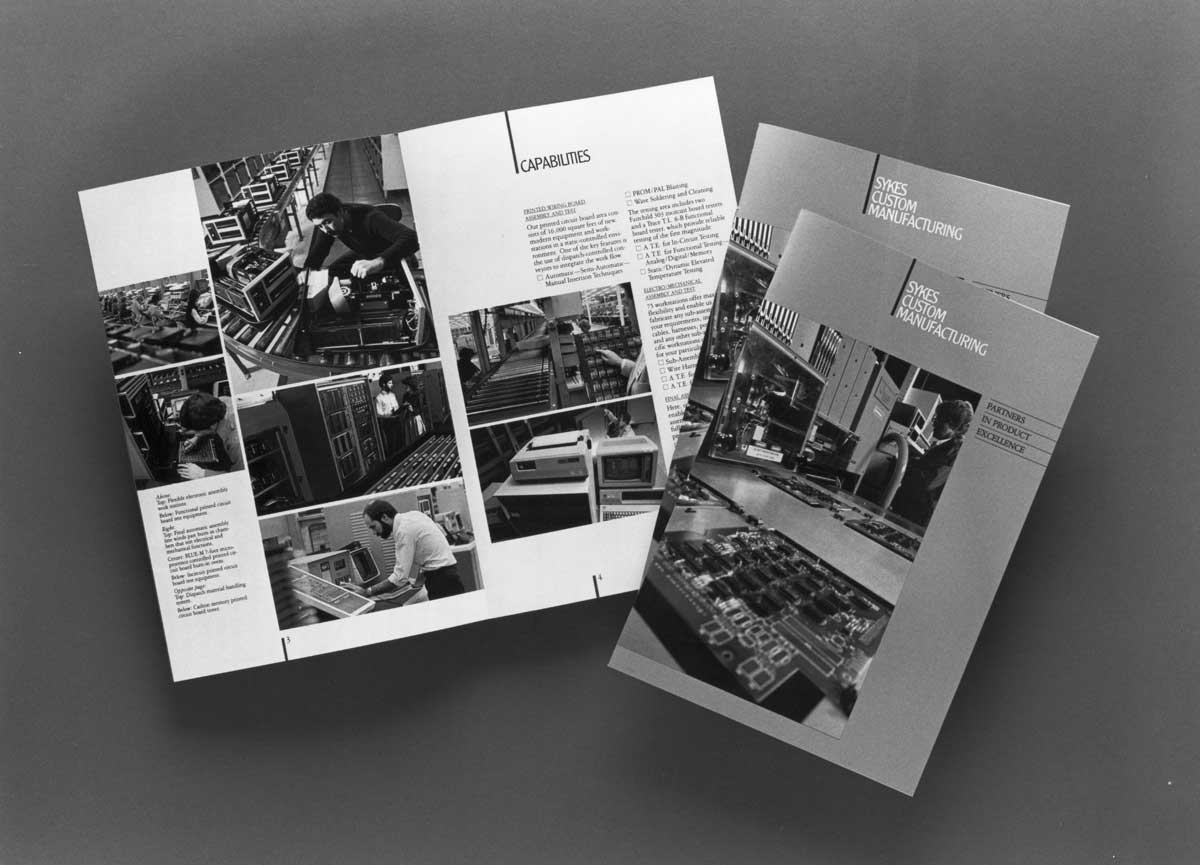
Exploring Sykes Datatronics
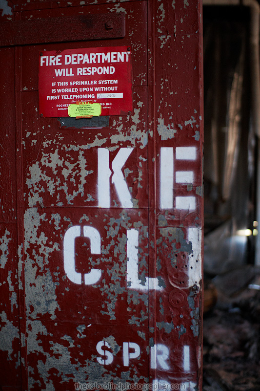
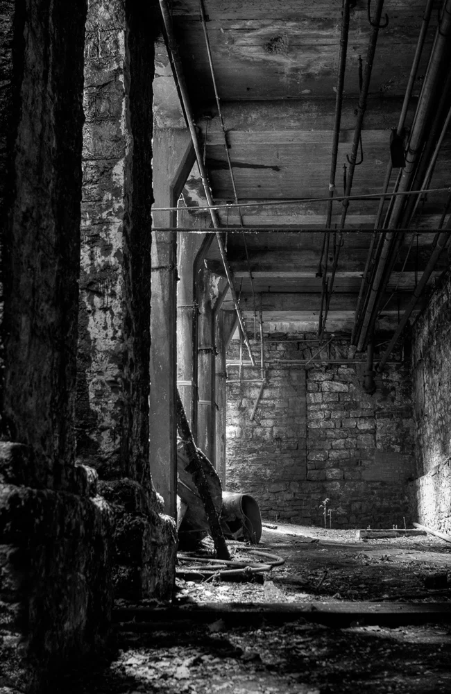
Sykes Datatronics was a successful computer manufacturer in the 1980's but ultimately fell due to mismanagement and competition with companies like IBM who muscled them out of the personal computer business. This resulted in them abandoning their location in Rochester, NY in 1990. Since then the building has been unoccupied and has suffered damage from a number of fires over the years. There is no future for this building beyond being an interesting location to explore and probable demolition eventually, which is unfortunate because it has a certain character that you only find in buildings built around the turn of the last century.
As abandoned locations go it's an easy one to explore. The flooring is solid, the wooden surface may be warped and wavy (very cool!) but the wood simply sits on top of a solid concrete subfloor. Even while everything else in the building is succumbing to the elements, scrappers and fire the building has still remained structurally sound compared to many abandonments. There is plenty of light throughout the majority of the building. From the first floor to the top floor the natural light coming in through the windows keeps the building from having many dark corners so a flashlight is hardly even needed unless you venture in to the basement.
For the most part I didn't get my head in the game, photographically speaking, but I did walk out with a few photos I like, some taken towards the end of the trip when I finally set up my tripod and pulled the 1D Mark II out with a wider lens. Otherwise I just wandered with the Rebel & 30mm taking some shots to record the sights in the building. You can see the photos from the trip below.


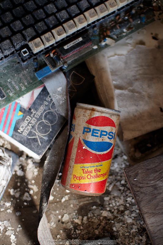


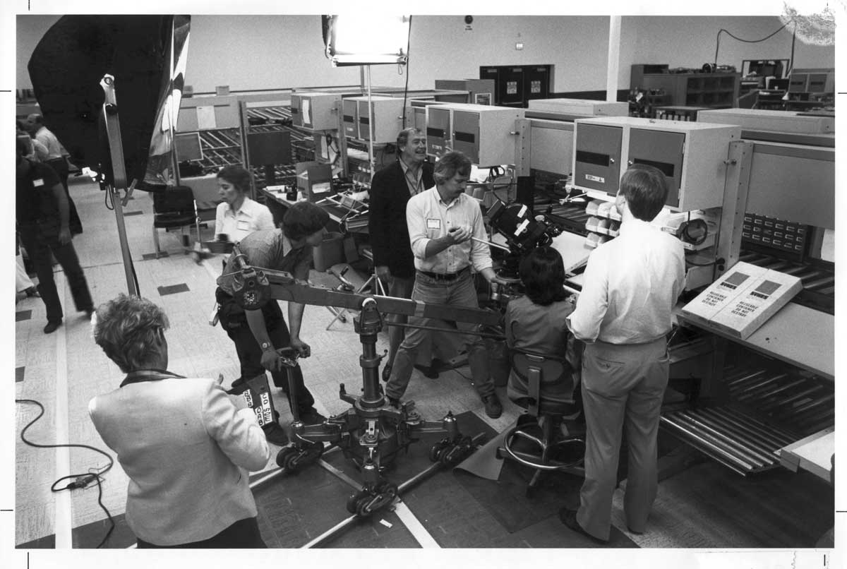
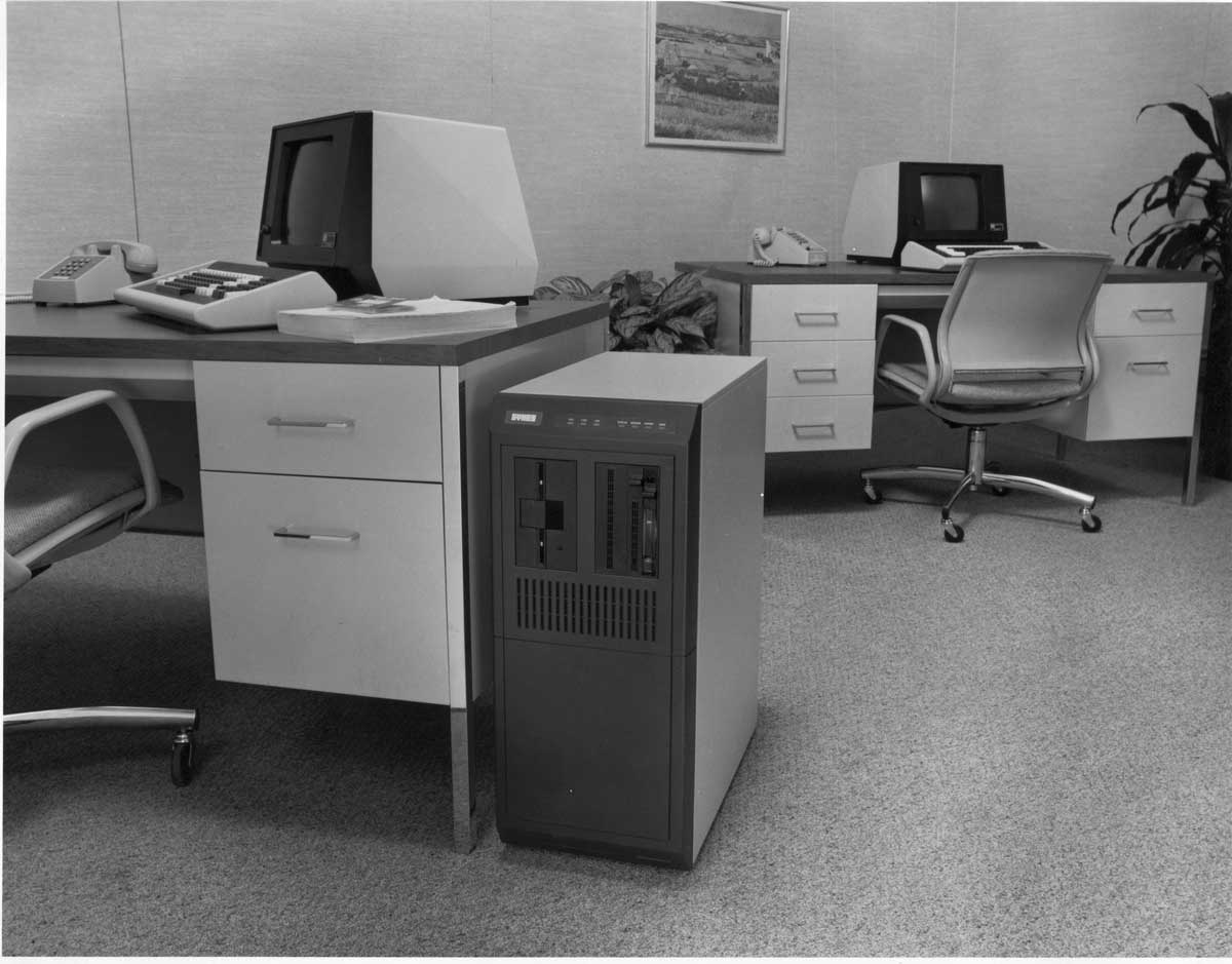
Nate & Lindsey found a set of photographic prints which they shared with Andrew and myself. Normally I don't take anything out of a location but we all wanted to bring these back to scan and preserve them. The images below are all the scans of these prints. I don't know anything about them and while some are self explanatory there's no information to go with the others.


This was a lot of writing being as tired as I am from this long day, so hopefully the spelling & grammatical errors are not too grievous!
Suggestions for colorblind hikers
A friend of mine forwarded this link to me which has some suggestions for colorblind hikers who have trouble identifying blazes on trails. The article outlines one particularly interesting way to help identify the colors of the blazes: carry paint samples to reference the blazes against. It covers how to make these and how to use them as well as some other tips to help colorblind hikers.
Another approach that I think would work well would be to carry colored filters to aid in identifying the blazes. A blue filter would make a blue blaze look brighter and a orange filter would make orange blazes brighter for example. A tool like the Seekey could also be useful in identifying the color of the blaze. Good lighting will help when comparing the blaze to the paint sample or when viewing it through the filter, so if it's too dark a flashlight (preferably not one of those cheap purply LED ones) may obviously be useful.
Source:
Helpful Suggestions for Color Blind Hikers, the New York Outdoors Blog
(I own a copy of one of their books, 200 Waterfalls in Central & Western New York)
Gene therapy might be the end of color blindness
I saw this BBC article the other day and the topic immediately interested me. It seems gene therapy may hold the answer to eliminating color blindness in humans, based on this successful test on monkeys. I've never put much thought in to the concept of curing color blindness. At least personally I don't find enough of a hindrance on a day-to-day basis for it to be crucial for me. Some people may feel otherwise, particularly when their vision could prevent them from being able to become a pilot, or makes it impossible to identify the colors of traffic lights, wire electronics or perform any of a variety of other color-dependent tasks. I probably wouldn't be allowed to get a pilot's license and I certainly have trouble with all those color-coded wires in electronics, but over time I've gotten used to a number of the challenges I face.
The therapy was performed on young male monkeys, Sam and Dalton, and the results from the two year treatment have remained stable. While correcting color vision deficiencies caused by issues with cone response is one possible use for this technique, this Wired article also points out that it could be used to threat age-related macular degeneration which also impacts color perception.
Eliminating color blindness
What impact could this have on me, or other colorblind people' It seems likely that such a treatment could only be applied when someone is still young, so it might be too late for me and plenty of others. Artistically it is interesting to think about because many times I have seen it mentioned that people find the colorblind have a very different approach to the use of color and often it impacts how they use photography or other art forms which can make their work unique compared to color normal artists. Whether I agree with that or not is hard to say, I certainly have not personally seen sufficient evidence to support it but I'd like to believe it's true!
Another question that rises to mind is whether everyone who is colorblind would even be interested in this kind of treatment. Many deaf people have formed a community and culture around their shared hearing differences and resist treatments or implants which might improve or restore their hearing. I have never seen that kind of community for colorblind people though. In many ways we're left to our own devices to compensate for our difficulties and interact with the world around us.
Hard solution to an easy problem
Sometimes it seems like those with color vision deficiencies are overlooked. You can use a computer without hearing, most operating systems will even read what's on the screen aloud for those who are deaf but accessibility for the colorblind remains poor. Color combinations chosen for software are often exactly the wrong thing for those who are colorblind and there are poor or often nonexistent accessibility features and tools in place to get around this or let you change the colors. When you can change them, it isn't always easy to do. Chat clients, like Digsby, are notorious for using red & green to indicate the away status of your contacts. Unfortunately I can rarely tell whether someone I want to talk to is away with a quick glance because those colored chicklets are useless to me, I have to hover over their names to see whether they're away or not. This might seem like nothing but over time repeated offenses like this by the applications most people use and take for granted every day can grow to be somewhat frustrating. Plenty of other programs get this wrong (Microsoft Word uses red and green to indicate spelling and grammar errors) as well and it's a problem outside of the computer environment too, as I mentioned in the Seekey article.
Perhaps this kind of treatment will solve the accessibility issues that colorblind people find on a daily basis. It seems to be rather drastic and distant (it doesn't seem likely that this will be available to the general public for a while still) compared to the relatively simple and immediate effect that changing the default colors used in software or devices could have. At the very least it should be reasonable to have alternate color schemes easily available for software to improve usability. OS-level utilities could eliminate the need for programs like WhatColor and eyePilot as well.
Handy tools for the colorblind: white balance references
One very important aspect of certain types of photography whether you're colorblind or not is correct color reproduction. There is a lot that can go in to understanding and properly white balancing but the reality is that today there are many simpler approaches to ensuring correct color that eliminate much of the guesswork or the need for a deep technical understanding of the issue! You don't need to white balance with a piece of white paper, or anything white at all. You do need to make sure you white balance off of something that is neutral and reasonably well lit but not blown out from the camera's point of view. There are plenty of products out there trying to muscle each other out of the way but which ones are useful' This article won't review each of them but will hopefully give the reader, in particular the colorblind reader, some perspective to help them choose the right tools for the job.
The reality is that the majority of the tools on the market work, but some work better than others and will work better for different situations. There are reviews out there from people with the eyes to judge whether the products are doing the job so rather than go down that road I'll just suggest you follow some of these links if you want to learn more in detail about these products. Below are a couple of articles I've found and read that compare a variety of products that are on the market. They're both by the same author, but there are numerous reviews of specific devices all over the web and if you have any questions about any of them don't hesitate to contact me! I have not tested the products in the two links below so I cannot vouch for their complete accuracy but they still provide a good sense of the realities of white balancing.
An Investment in White Balance that Appreciates Right Now
Product Comparison: Reflective White Balance Devices
White what?
White balancing is the process of setting the white reference for the camera, calibrating it to the color of the light source. In other words your camera has no idea what white is without taking a reading off of something in the scene. If you use automatic white balancing in your camera it is looking for the bright objects in the scene and assuming they're supposed to be white and that their appearance is dependent solely on the color of the light source. It then adjusts the balancing of the colors in the image to ensure those brightest areas become white.
Cameras can be easily fooled when the brightest object in the scene is not actually supposed to be white, however the majority of scenes are such that auto white balancing (AWB) usually gets pretty close, even if not perfect. White balance presets can improve performance under certain lighting like tungsten or fluorescent which can challenge the AWB computations. The best way (other than using a color temperature meter) to determine the correct color temperature for the light source in your scene is to take a test shot of a neutral reference and use that to manually set the white balance in camera. Many people do this with a piece of white copy paper although this isn't always a reliable white target since optical brighteners among other variations in the color of paper can mean they aren't always a true white. There are plenty of other creative solutions, even putting translucent tupperware over the lens to take a custom white balance reference shot.
Identifying wrong colors
Proper white balancing is important if you want to ensure that your photograph accurately represents the color of the subject. For many people with bad color vision it can be very difficult to know when something is right or wrong. It's usually not good when a person's skin tone is wrong, or you misrepresent the color of a product in your photography... especially if someone is paying you for the result! People with normal color vision may be able to rely on their eyes and a calibrated screen and adjust color by appearance alone, although many will still use a reference target to eliminate guesswork. Sometimes you don't want a 'neutral' color balance and you might choose to warm up the colors a bit which is often pleasing on skin tones. Some of the white balance products, like the baLens, come with a second insert which will provide a warmer color balance. Otherwise knowing where neutral is can give the colorblind photographer a starting point for tweaking the colors.
One of the commonly held beliefs is that all colorblind people will impart a particular color emphasis on their photos when they process them. In other words a deuteranomalous person might be guilty of making their photos a touch too green (as sometimes I have). The problem is that while this can be true, it's not always by the same amount and not all colorblind people will be able to discriminate the subtle differences that make detecting any other color issues possible. I am deuteranomalous but I also have poor color discrimination of all colors, so a small cyan or yellow shift might not be noticeable by me and if I did know something was wrong I'd be challenged to figure out what or by how much. Traditionally the only way I have been able to ensure my colors are both accurate and realistic is to have someone with normal color vision view the results on my calibrated display (one reason I keep my display calibrated, among others) or their calibrated display. You don't even have to be colorblind in the traditional sense to have trouble with color correction, just having poor color discrimination can cause all kinds of trouble.
When possible I can correct photos based on assumptions about what color certain objects in the scene should be. This works best with gray objects like concrete, however as concrete ages and discolors this can prove to be a tricky and unreliable method. Having an understanding of what color something should be and working with the RGB values can help to correct some issues but is obviously by no means a universally applicable solution. So what alternatives are there?
White balancing products
In the attempt to not only improve the color in your photographs, many companies have offered a variety of products which can be useful in white balancing. The majority of white balancing products fall under two categories: devices you put on your lens and reference materials you place in your scene.
Lens-based devices like the ExpoDisc or baLens require that you mount them like a lens cap or filter and take a photo with your camera pointed at the light source. These products contain various diffusing materials which are supposed to be spectrally neutral and allow you to use the resulting image to set a custom white balance. I have had the opportunity to experiment a bit with each of these and the ExpoDisc seems to be a somewhat more reliable product. The baLens proved to be troublesome when the manufacturer was demonstrating it at the PDN PhotoPlus expo last fall. These products will blend mixed lighting together as well depending on how you use them. If you want to ensure that a certain object in your scene is correctly color balanced you need to be careful when using these to make sure you white balance to whatever dominant source is illuminating that object by pointing the camera at that source with the device fitted.
One problem I have with these products is that you need to either have one to fit every lens you might use it on or you need adapter rings to allow them to fit. More significantly, I personally prefer reference cards which you include in your scene or in a test shot. With these products you then use the white-balance eyedropper tool in your RAW conversion program (you better be shooting RAW!) to sample the reference card and set the white balance. This method can have drawbacks as well; unless the reference is in the right area and the reference is relatively devoid of serious noise issues, you can have problems with the RAW conversion utility misjudging the color temperature. A noisy image will introduce errors due to variations in pixel value which is why it's best that the RAW conversion program doesn't sample a single pixel but instead averages over an area. Placing the reference correctly is important as well, you need to position it where it will be illuminated by the source you want to white-balance to. If you are shooting in mixed lighting this can be a bit tricky since the card in one position may let you white balance to one source but if the card is moved to another position you may be correcting for a completely different source. Some of these reference cards come big enough that you can also use them as you would a sheet of white paper and just take a frame-filling image of it to set the white balance manually in camera.
As the links above show, the various products each have their strengths and weaknesses and it's best that you consider how you shoot and want to include the device.
A few options
The products below include different types of test targets and lens cap/filter like devices:
Lens cap/filter type devices:
- Expo Imaging ExpoCap and ExpoDisc
- baLens cap
- CBL Color Balance Lens
Reflective reference devices:
- Digital Image Flow Digital Grey Kard
- WhiBal reference gray cards (I have a few of these)
- X-Rite ColorChecker, the current form of the classic MacBeth ColorChecker and some other new variants
- Datacolor SpyderCUBE, an interesting new tool which I am considering trying
To read more about the SpyderCUBE there's a good introductory article to this device and all it can do here.
http://www.bhphotovideo.com/search/ss=X-Rite ColorChecker&BI=4515&KBID=4984
Exploring Flintkote in Lockport NY
On August 2nd I joined a number of Rochester & Canadian explorers on a trip out to Lockport, NY to check out the abandoned Flintkote facility. This structure is not far from the center of Lockport and natural encroachment by new tree growth shows that this abandonment is roughly three decades old. Flintkote made a variety of products from asphalt shingles and road materials to various asbestos materials. Ultimately asbestos related claims, which this location produced, are what brought Flintkote down. Everything being damp didn't hurt but proper safety gear isn't a bad idea.


Unfortunately I didn't shoot terribly much at Flintkote. I wish I had brought more appropriate equipment to capture some of the rooms and features of the abandoned buildings but I decided to travel light instead. This is definitely a location I will revisit and I already know what equipment I will want to bring with me to capture it better if I return.
Note: this post lost a few comments in the migration.
Seekey allows the colorblind to see colors again
As with most red-green colorblind people I have trouble with many things. Someone with a more severe deficiency than I may find traffic lights difficult to interpret but even in less critical areas the inability to tell red and green apart reliably can be quite frustrating. If I walked around any office or my house I could easily find many things with indicator lights that are a variety of colors. Most are some combination of red, green and yellow. If red means charging and green means ready then how am I to know which is which?
When you live with this sort of problem for a while you get used to it, sometimes you can find ways around it. With one of my camera chargers I find I can tell if the LED is orange or green by putting my eye right up to it and letting the LED fill my vision as a blurry mass of color. By doing this I am at least able to fairly reliably distinguish which color that particular device is displaying. This doesn't always work and it isn't really a very practical solution.
One way to make it easier to distinguish colors is to use colored filters. There are a number of ways one could go about this but we can fairly easily summarize the basics by looking at a color wheel. A basic color wheel as shown on the left consists of the additive primaries (red, green and blue) and the subtractive primaries (cyan, magenta and yellow).
The additive primaries combine to create white while the subtractive primaries combine to create black. Both of these concepts form the basis for many types of display and printing systems. With the right C, M and Y primaries a printer could in theory produce a full range of colors and neutral tones and with R, G and B a computer monitor or TV can display the the full range of colors and neutral tones as well.
The positioning of the various colors is important too. If you looked through a red filter at something cyan in color you would see that it becomes very dark (the basis behind using a red filter to darken the sky in B&W photography). On the other hand looking through a red filter at a red object would make it appear bright by comparison. Based on this wheel a colorblind person could carry some color filters with him to help understand the colors in his surroundings. Red and green filters could be used to help distinguish between red and green indicator lights for example. Hold up a red filter and the green lights would dim while the red lights appear bright. The opposite happens if you hold up the green filter.
I have considered carrying filters in this manner although much of the time I can get by without them and fact that they would get torn up fairly quickly in my wallet made me rule that idea out. The Seekey gets around this problem by having green and red hard plastic filters housed in a slim case for protection. You can easily swing out the filters when you need them, making this a much more convenient tool in many ways than dealing with flimsy, floppy gel filters.
The Seekey was invented by Kenneth Allblom and is available for purchase using Paypal from almost anywhere although getting one delivered to the US isn't cheap since they're located in Sweden. After shipping a Seekey costs over $50 in the USA but I felt it was something worth trying and writing about for the site and that it's something I would be glad I had in the long run for my own ease of interpreting colors.
The Seekey is shipped well protected and with a sheet of paper explaining its use. There really isn't much to say about the Seekey, it works as expected and as advertised. The price is steep but my curiosity got the best of me and I can say it's a fun little toy and in many ways has good conversation starting potential. Is it really worth the price' That's a tough thing to say, I don't think I would generally recommend it to everyone but for those with severe enough color deficiencies it is certainly worth looking in to.
Check out the Seekey website for more information and to see some more explanations of its use.